Milwaukee Flag Design
Title:Milwaukee Flag Design
Medium: Paint
November 12th
|
Title:Milwaukee Flag Design
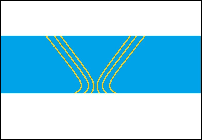
Medium: Paint November 12th 2015 Exhibition Text: Milwaukee is the most populated city in Wisconsin with just under 600,000 citizens, and is well known for multiple things, some of them being: The Milwaukee Art Museum, the brewing Industry, and the great lakes. These were the things that I decided to try and incorporate in my flag design. The Blue surroundings symbolizes the unpolluted waters that side beside Milwaukee, the curved beige lines represent the famous arc of the Milwaukee Art Museum, while color of lines represent the brewing industry by symbolizing barley. |
Inspiration
When I was introduced to this project I was first shown a Ted Talk that discussed how flags had impacted someones life and how vexillology [vek-suh-lol-uh-jee] the study of flags, was so important to them. They later on went to discuss how countries and many cities are great examples of flags that represent the country with correct symbolism and simplicity. Unfortunatley it turned out that US cities had some of the worst flags created and Milwaukee being the worst of them all, I was given the chance to offer a different design. Flags had to follow Five simple rules:
1. Must be different and easy to distinguish.
2. Cannot have any Words or letters.
3. Symbols must represent the place in some way.
4. Use clean and simple colors.
5. Must be simple enough for a child to draw it from memory
Following these rules, I began looking at other flags from other cities within the US and most had not followed these rules. I had found one flag that had appealed to me and had followed most of the rules that flags needed to fullfill. It was the flag of Roswell New Mexico, with its and meaningful symbolism, simple form and clean look it was nearly flawless, its only flaw was indeed the exccessive complexity in its color scheme. This flag none the less conveyed its message with no words and was easy to remeber, these were the same aspects that I wanted to create my design of the Milwaukee flag.
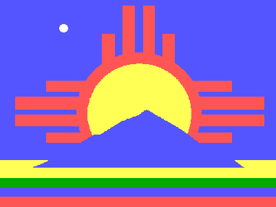
Flag of Roswell, New Mexico
Research
Since I wanted to incorperate aspects Milwaukee is known for, I begun to look for things that I also could someway incorperate in my design. Milwaukee happended to be the most populated city in Wisconsin, having a popultation of just under 600,000 and 1.57 million in the metropolitan area, more than Madison, Wisconsins capital city. Milwaukee was aslo very well known for its brewing industry, being the home to multiple large brands and the Miller stadium home to the Milwaukee brewers. In addition, Milwaukee is also neighbors to the great lakes, with the famous Milwaukee Art Museum on the shore of Lake Michigan, a contributing factor to Milwaukee history with immense snow falls in the winter.These were the factors I had choosen to incorerate in my flag design.
Creation and Sketches
|
The First few slides are pictures of sketches I made before I started creating my flag, and I wanted to have blue hues in my flag design, hence the reason blue is in all of my planning sketches. I had also tried adding an anchor to symbolize the large body of water next to Milwaukee but unfortunately I could not find a way to incorporate other symbols of Milwaukee while following the five simple rules. To me the anchor was to complex to be completely drawn from memory. Another thing that to be taken into account was that this flag must still be comprehensible even if it is blowing in the wind and viewed from being. My final piece incorporated all these factors, while having symbolism. I had created my design using a very simple program, and by using a program that was not really meant to create amazing pieces , it help me keep the design simple. I first starting by creating my background which was a solid light blue, that symbolized the Great Lakes near Milwaukee, I had to have the blue area with in proportion of the two white areas left behind that symbolize the immense snowfall Milwaukee has during its winters. I then had to create the arcs that represent the Milwaukee art museum with its curved arches and the brewing industry symbolized by the color of the arches, also the population of 600,000 with its 6 arches. The most tedious part was definitely creating the arches, because they had to be of identical size and shape for each to symbolize the same factors. I had first tried creating each arc by hand and I could not seem to be able to create even remotely similar arches on each side, and if they were not the same they would become too complex to draw from memory. I then duplicated one side of arcs and added it to the other side while paying close attention to proportions, the amount of blue on each side of the flag could not have major differences.
|
|
Reflection
|
In conclusion, I don't see anything I would like to change with my end result. Although, in the future I would like to try and experiment with other editiing programs more before starting the design so that I could be in more a creative state. Also if I were to somehow add some sort of revisions I would try to incorperate more Aspects of Milwaukee.
Resources http://www.jsonline.com/news/milwaukee/census-figures-show-milwaukees-population-holding-steady-b99504147z1-304511781.html https://en.wikipedia.org/wiki/Milwaukee |
|
