Self Portait
InspirationFor inspiration for my piece I had chosen the Marilyn Monroe Piece by Andy Warhol from the Pop Art Movement. Warhol's piece, and most of his work appeals to me for their simplicity with in their color scheme and in order to not create a direct copy I had to look at it differently. Since this was not my first time using the pop art movement for inspiration it was much easier this time to come up with ways to add my own personal touches. In my digital collage assignment I had also used a piece that was created by Andy Warhol during the pop art, which had also focused on the Marilyn Monroe. Andy Warhol had managed add a very dense and elegant atmosphere along with this specific Marilyn Monroe piece due to the way the background hue contrasts with the central area of the painting.
|
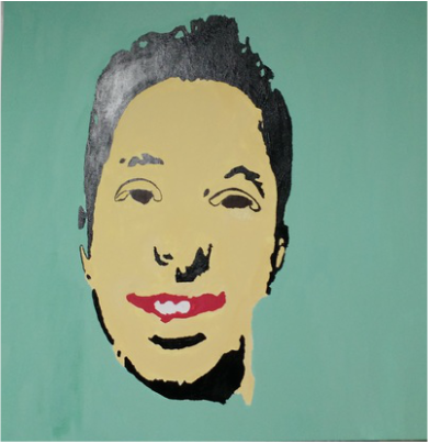
Monty's MonroeSelf Portrait Created with Acrylics, Stretched on a Wooden Canvas
December 2015 92 cm by 92 cm Exhibition Text For the very first self portrait that I have ever created in my entire art career, I choose the Marilyn Monroe by Andy Warhol as my inspiration. To create it, I used acrylic paints for the entire piece, and had used a projection to trace onto the Gesso'd canvas as guide for myself. The colors that are not red white and blue were mixed entirely by hand. In order to not create a complete copy of Warhol's piece, I had to use a very different color scheme for the face portion of my piece. 
Marilyn Monroe by Andy Warhol
|
ProccessFor my first self portrait that I had ever created, I had chosen to create a translucent printout using Photoshop. After Creating the translucent I then began to stretch my canvas using simple tools, a staple gun, hammer, and gravity. After the Canvas stretched tight enough I then began to apply Gesso to the entire canvas, until I could no longer see any of the fabric as it was before. The background came next, this when I had to test my abilities mixing paints. Then for my hair and dark areas I had used black, one of the key differences between the original Monroe piece and mine. Then came the applying paint to the facial features, for the skin tone I chosen to use a very light gold. For the lips I used apple red and dark brown for the eyes. I found it best to apply second coats 5-7 minutes after the first. When applying paint to areas where there are lines that can't be crossed, I had to use the paint brushes that created the smallest strokes. This was something that I struggled with when creating the piece, due to my lack of experience with larger portraits. During my sophomore year of art I had experience with replicating and attempting to create skin tones that matched with the pieces that I was creating, at the time as not adding any sort of personal artistic additions because these were solely reproductions that were meant to build experience. When creating this piece, I had to decide for my own on what sort of skin tone I was to apply. When I choose not to attempt to reproduce my own skin tone I was fulfilling one of the rules that I had, which was to avoid creating a copy of Andy Warhol's piece. Although by choosing the sort of skin tone that I had created, it made it more difficult to reproduce in case I wanted to go back and add corrections.
|
|
Reflection
|
In conclusion, I wish I had given my piece more attention within the finer detail and areas that require a very small paint brush. Despite this, for my first self portrait I was slightly satisfied with the outcome. Although I would very much like to consider different tones for the piece, especially the facial area. The black hue that I had given to the hair and the dark areas of the piece serve the painting well in my opinion, but I would still like to consider other hues for the hair. In the piece by Andy Warhol, the hair was given a hue that would usually be perceived as blond, in my case did I not only want to avoid reproducing Warhol's work, I wanted my piece to reflect my own facial features. In terms of improvement or change I would use a dark or light brown because they still reflect my own features.
|
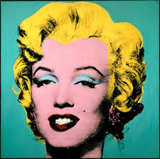
Original Monroe Piece
(n.d.). Retrieved December 15, 2015, from https://andywarhol.portrayal.link/9/
The Piece That I created
|
